Mini... The Dough-Nut
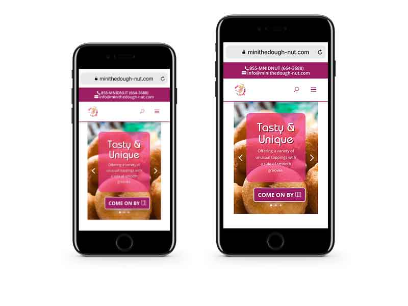
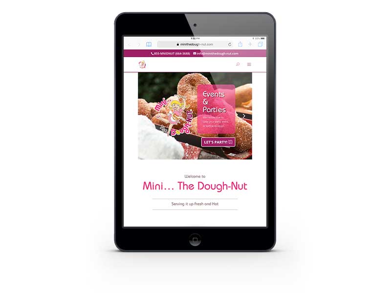
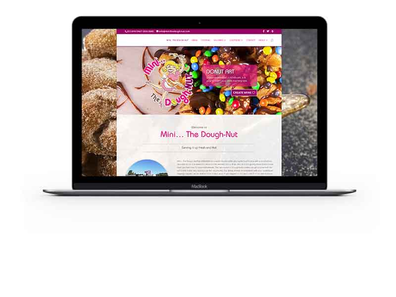
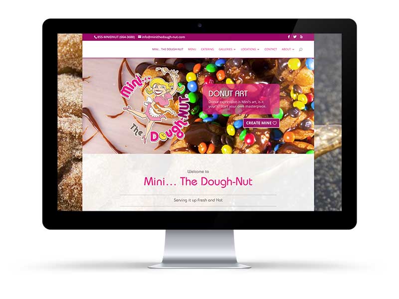
Responsive Website DesignFun places deserve a fun site. Mini The Dough-Nut is definitely a fun place to visit. BHD built a website that reflected the experience that you will get when you visit either the Mini The Dough-Nut location or the trailer comes to you or your event.
Goal
- Give “Mini… The Dough-Nut” a modern and fresh new look
- Re-create the experience you have when visiting the Mini donut sho or donut trailer
- Develop a mobile friendly website that is responsive on all devices
Strategy
- Really listen to the client, visit the donut shop, get a good feeling of what Mini’s customers expect to enjoy
- Design in adherence to current development standards to ensure proper responsive layout across all devices
- Determine the importance of information and develop a hierarchy to guide us with the layout
- Use new photography to highlight the product
- Vibrant colors and drop shadows to make the new Mini… The Dough-Nut site really pop
Result
- An eye catching, mouth watering, fun website that mimics the feel and look of the donut shop, trailer and staff
- Stable and fast loading on all devices
- BHD to delivered the project on time and under budget, to an excited, satisfied client


